I liken mobile web design to designing for handicaps, in that good ideas in designing for handicaps benefit all users alike. For example,
- Writing text for screen readers for the blind—rather than embedding text in images—lets seeing people find, copy, & zoom the text too.
- In a presentation, leaving an extra pause between slides lets interpreters keep up with the material and lets native speakers absorb the material better. No one has to multitask between reading the slide & listening to the presenter.
I think the same killing 2 birds with 1 stone applies to designing for mobile devices.
Google PageSpeed got me thinking about this, as it recently added User Experience and Mobile reports, where they warn you e.g. if your buttons are too small for users’ fingers, or if your plugins won’t work on their mobile device.
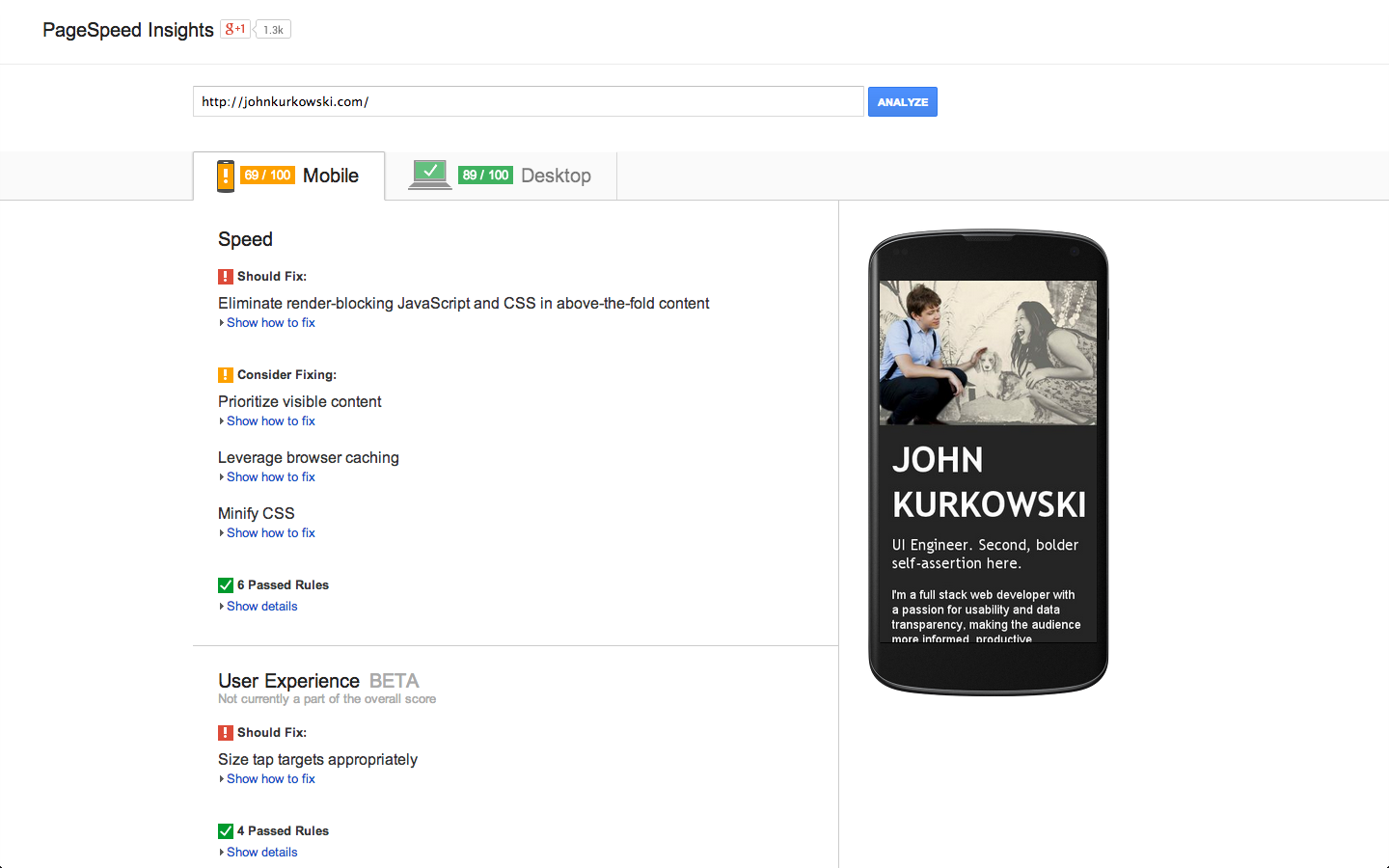
Also notice the handy preview of what it looks like on mobile. Not revolutionary, but when you don’t already have an expansive device lab, the preview and tips are a nice link to send to your boss and remind that you’re alienating smartphone customers.
Go ahead, send your boss the link to your web page’s analysis.
We Haven’t Had Time For That
If PageSpeed Insights gives you bad marks for Mobile, this is the point the web site owner gets defensive.
“Oh, we haven’t optimized for mobile yet…”
This attitude incorrectly assumes desktop and mobile are completely separate efforts. I don’t think mobile always needs to be. Because a) users will put up with more than you think, and b) good ideas that come out of mobile design are good for desktop too.
Those earlier tips about finger sizes and plugins on mobile? Those are good tips to keep in mind everywhere. Kill 2 birds with 1 stone.
”But there’s so much different about mobile! Mobile First, Responsive Design, Goldilocks. Most of my users are on desktop anyway. How do I pick?”
I don’t advocate an absolute need to stop the presses and switch to these strategies. I believe you should separately investigate and adopt them if they fit your needs and resources. On the extreme, a tailored experience on every device is best. But it’s understandable to be too overwhelmed, too entrenched in desktop-thought to consider these, and instead seek the most user experience bang for your buck.
You can start with PageSpeed’s tips. Then I’d like to add a few web design antipatterns I’ve witnessed over the years. Following both sets of tips should benefit all devices simultaneously.
Why This Is Important
I think I’m preaching to the choir that mobile user bases are sizeable, and your development resources are finite.
If you’ve deliberately chosen against any mobile user experience, is it because you’re trapped in a mindset of, why would anyone use the web differently than me? Do you think, everyone will use my site from a hardware setup identical to mine? Only from a single device? Think again.
Your analytics might say your visitors are mostly desktop, but users too lazy to get off the couch are itching to try out your site on mobile. They might be in for a surprise when it doesn’t do what they think it can do. Do you want to take the chance they’ll give it a second try on a different device?
According to Don’t Make Me Think, the primer on web usability, users will continue to put up with your frustrating site, to a degree. You’ve hooked the mobile user a little while longer. But if you’ve succumbed to a bevy of bad desktop design patterns, your site won’t contain the answer for mobile users, because you’ve made it hard to reach, or even impossible. You alienate people whose only option is a smartphone, or who don’t want to get up from their couch, or who are on the go.1
So how about those 2 birds with 1 stone? Stop making excuses to your mobile audience. Keep the following ideas in mind. Benefit both desktop and mobile customers.
The Good Ideas
You should check out PageSpeed’s experimental User Experience report’s advice by running it against your own site. I’ll link to each tip and expand on them here. Then I’ll mix in what I wish was in the report.
From PageSpeed
My (Stolen) Ideas
1. Size Tap Targets Appropriately (link)
Pour your blood and sweat into making a web page, and you’ll internalize its flow. You constantly test its dark corners, probably more than your users. Doing this testing, you get adept at navigating to all your content’s links. All this practice with your own content, let alone your life as a web developer, has refined your motor skills for operating a mouse to select small targets. Your users may not have this same expertise. The situation is only worse on mobile, with the variability of device and human finger sizes.
Solution: big click targets, and make them look clickable (like a button). They’re more visible and easier to click on.
Read PageSpeed’s recommendation. They talk about the minimum millimeter margins between elements on a mobile device. Millimeters? Hell, big click targets are a good idea even when we’re talking much larger than millimeters. Go big.
Further reading:
- Fitts’s Law
- The Opposite of Fitts’s Law - what about things we don’t want users to click on?
2. Avoid Plugins (link)
Adobe Flash: don’t use it.
Google cites its security flaws, crashes, and battery drain. I say it’s too easy for web designers to build unusable things with it.
As an example, restaurant web sites seem to favor Flash but this neglects a large part of their audience who is on-the-go. Among a group of friends ready to go out, pondering what to eat, I want to answer: what’s on the menu, is the restaurant open right now, how do I get to the restaurant? Let me get out my phone.
Instead I’m greeted with a Flash intro—one more download to wait for and link to click past—and a Flash site standing in my way. Using raw Flash (and not a higher level toolkit like Flex), the web designer amateur breaks standard operating system scrolling, copy paste, screen readers, and more. We’ve known Flash has been thwarting usability for 10 years. Flash is also completely unusable on iOS, a sizable and spendy portion of mobile users.
Flash can be accessible. But for some reason its ecosystem makes it easy to skip that part, and proceed directly to visually and aurally wooing potential customers.
Shouldn’t you invest in people getting to your restaurant instead? A linkable text menu, a clickable phone number? Integration with familiar services that do your job better than you can, like Google Maps for directions, OpenTable for reservations? Much easier than hiring a Flash artist consultancy to counterfeit all that, and then maintain their work.
I focus on restaurants because they’ve been frustrating me a long time. Though breaking basic operating system usability and wasting user time are no-nos for everyone. Reconsider your desire to be stylish and unique. Focus on content and use, a lost art that packs a superior ROI.
3. Configure the Viewport (link & link)
Sure, do it. It’s a few lines of code at most.
Although it is far from the greatest upset if your users have to pinch and zoom and pan to reach certain corners of your site. If it’s the only way to get what they want, again, they’ll put up with it.
The greater upset is violating the other design guidelines in this article and making those corners inaccessible entirely!
4. Use Legible Font Sizes (link)
Don’t make your users’ job harder then it has to be. Let them read your content.
“But there’s so much I want to say! Bigger font sizes mean less room!” you cry. If you follow the next tip, this shouldn’t be a problem.
My (Stolen) Ideas
Here’s what I would love to see added to the User Experience report.
5. Remove Half Your Content, Then Remove Half Of What’s Left
Maybe Google PageSpeed can’t tell you what to write. But I can. The answer is less.
People don’t read. They scan for the information they’re looking for. They don’t want to think. So there’s no time for people to read instructions, digest your myriad widgets and ads, or internalize the specifics of your web site. There are a million other web sites they have to keep up with. Your text is not special.
Then on mobile, a wall of unfocused content is like trying to peruse the New York Times through a keyhole. Not saying it can’t be done. Just help your users by getting to the point and removing distractions.
Solution: listen again to Don’t Make Me Think. Write your text, then, before publishing …
Get rid of half the words on each page, then get rid of half of what’s left.
This benefits not only the paragraph you shorten, but your whole site, as this exercise forces focus on your site’s core values.2
6. Avoid Interaction & Modes: Hovers, Menus, Modals
One day I hope the User Experience report could automatically include these points from my Credo, because I see them violated again and again:
- “Show the data.” — Edward Tufte
- Avoid implementing interfaces that hide their data, especially across different input devices and accessibility issues.
- Avoid interaction & modes.
- Most software is information software and should minimize interaction & modes.
Let me explain what I was getting at.
When presented with the problem of too-much-content-not-enough-space, some web site owners think, “I know, I’ll use a { tooltip hover, context menu, modal dialog }.” It is an antipattern to leap to these as your first line of defense. At best, they are an Easter egg-level progressive enhancement. More typically, they are a designer’s crutch for tucking away unimportant content you’re too lazy to give proper design attention or remove. The techniques a) hide what ought to be apparent to the user, forcing them to think, and b) convert the fundamental human-computer task, 99% of the time to read and learn, into interacting with the computer in order to read and learn.
Remember you constantly test your own site, navigating to all its dark corners? You may even become proud of this interactivity. But interactivity to your users is a cost, physical and mental.
Physical because the user has to exercise their mouse skills to invoke these data-hiding design decisions. Mental because they have to know to do it, how their situation changes when they do, and remember what they were doing beforehand. This is the problem with modes, temporary, sometimes imperceivable states in your software, where things suddenly behave differently than what the user is accustomed to. Or another task the user must context switch to and address, before returning to their original one. Like clicking the X on your “Like Us On Facebook” interstitial popup.
The dubiousness of modes is another article in itself. Let’s just say, every time you add a mode, you dump work on the user. You have failed your user.
Getting back to hovers, menus, and dialogs. These require modes, which are bad for the aforementioned reasons. On mobile, the story is only worse.
On mobile, hovering means a higher number of clicks to invoke it , or it is outright impossible, i.e. on many touch screen hover implementations.
On mobile, certain devices don’t have dedicated hardware for context menus. Regardless, however the user invokes context menus, don’t expect them to try every time they run into an invisible barrier on your site.
On mobile, dialogs add further to an already strained cognitive load, with the tyranny of single-purpose apps the user must already multitask between. A dialog is yet another. Also, in many web modal dialog implementations, they resist the user actually zooming, reading, and dismissing them (i.e. the more you zoom in, the more the dialog goes off screen).
By choosing these techniques, you have chosen to cripple mobile users. Nobody on the desktop likes them either.
Solution: data-hiding interaction and modes are costly to users, so avoid them. Instead,
- Show the data or descriptions or actions in context. If it’s not important enough to show in context, delete it (#5).
- Use direct and consistent text and symbology, so the user knows what they’re getting into without having to read.
- In the case of dialogs that gather user input, let users do it as part of their existing flow, not on your terms by interrupting them with something they won’t read anyway.
- If you absolutely must give the middle finger to your users by introducing a mode or interaction, prefer self-evident scrolling and hyperlinks3. At the very least, pick implementations that work on touch screens.
7. Avoid Interaction & Modes: Inner Scrolls
After web designers learn the importance of above-the-fold content (“users don’t wanna scroll; they’ll hit that Back button in n seconds instead”) they can take the guideline too far, focusing on cramming content. They ensure all their site’s widgets are above the fold by giving them their own, inner scrollbars, i.e. areas that scroll independently of the main app window.
I’ve worked with a few designers with this tendency. The work was not made public, so I can’t point to the worst of it. I’ll just have to point to more mainstream examples (admittedly not the worst uses of inner scrolls).
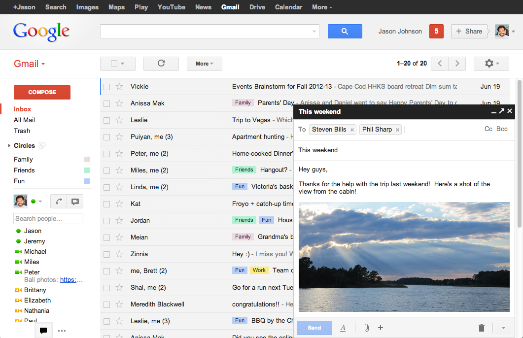
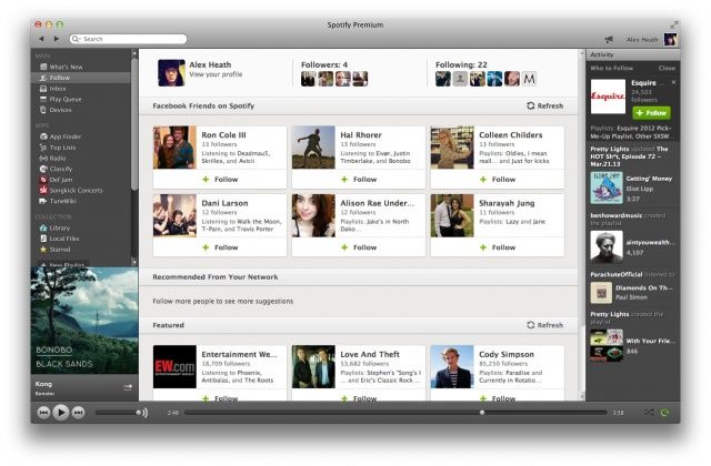
In Gmail’s New Compose, you can scroll the text of the email you’re composing independently of your list of inbox messages. In Spotify’s desktop client, there are 3 inner scrolls from left to right: a list of music sources, the currently browsed music, and a friend news feed.
On the plus side, this facilitates comparison. This is a valuable part of the most common human-computer task of learning. It even gives some extra sense where you are in the app, i.e. what data and operations are available right now.
On the down side, it introduces extra interaction cost to get at the data hidden within the scroll and it introduces a mode: the scroll only works when the user’s mouse happens to be hovering over the inner scroll’s area or scrollbar. The more inner scrolls, the trickier this gets. If you did the reading on Fitts’s Law, you know there’s a proportional slowdown in being able to mouse over any small scroll area. So it becomes costly to scroll if desired. Scrolling is often accidental, like scrolling one area when you mean to scroll another.
The inner scroll is only more finicky on mobile devices. It takes more clicks for the user to select the scroll they want to use. Or the scroll implementation just doesn’t anticipate touch at all. And the data it hides is again inaccessible.
It is often less cost for the user to just scroll the whole window for their desired data, because the user is more accustomed to scrolling that way, without dealing with modes.
Solution: let users scroll as they are accustomed.
- Below-the-fold content isn’t the end of the world. As long as there is indication it’s there.
- Facilitating side-by-side comparisons is good, but inner scrolls aren’t always the best answer. If comparison is a major use case, design for it. Better than putting work on the user, to line up the scrolls just right.
- At the least, use inner scroll implementations that work on touch screens.4
8. Don’t Restyle Form Inputs & Scrollbars
Web programmers know how hard it is to restyle standard form <input> elements
and scrollbars. Their style is tightly locked into web browsers and perhaps the
host operating system. Maybe this is a warning that you shouldn’t mess with
them!
This tip recalls #2 and #5, in that you should focus on valuable content, rather than distracting you and your users with style points. You’ll make users think (bad), “Why is this widget different?”5 Leave it alone.
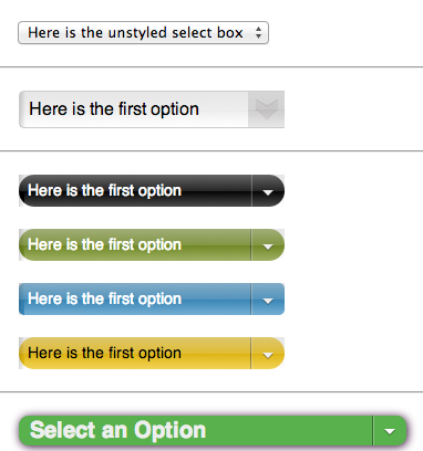
Also, because these custom versions are difficult to program, they virtually always behave poorly compared to native ones. They don’t respond to accelerators, form-filling tools, or they perform slowly.
Web users deal with forms and scrollbars all day. Why must yours look and work differently and poorly?
9. No, Really, Show the Data
I wonder if PageSpeed could issue a warning for too little content. It already takes into account the performance of your above-the-fold content. Why not the above-the-fold data density? The whole page’s?
When presented with the problem of too-much-content-not-enough-space, some web site owners forget they could free up screen real estate by removing
making space for solving the audience’s problems instead.
Screen real estate is at a premium on all devices. Make every pixel count.
Finally, if you’re hiding data on purpose out of fear of information overload, remember, “there’s no such thing as information overload, only bad design.”
Comparison To Mobile First
What’s the difference between what I’m proposing and Mobile First? There isn’t much, I’ve only avoided the comparison because I really just want designers to stop violating these tips, regardless of platform.
I share Mobile First’s focus on content, though the movement is a misnomer to what I’m proposing. Typical desktop design has spiraled out of control. The constraints of mobile have forced designers to focus again. That’s all I mean, particularly with tips #4, #5, and #9. The difference is, I didn’t say you have to think about how it looks on a phone first.
A phone isn’t the point. What if phone display sizes magically catch up with desktop? Will you then regress to including everything and the kitchen sink on your landing page? I hope you don’t. Instead, focus. Focus stands the test of time, anywhere.
Conclusion
The common thread among these tips is that following them empowers users on all devices. Doesn’t matter whether you target mobile. Meanwhile disregarding the tips hurts users on all devices. Sometimes it completely alienates them.
I think PageSpeed could recommend all these tips. Even if they’re not all objectively measurable, they’re all good to strive for.
My approach might not beat a mobile-dedicated design, but it’ll get you ready for one. If you’d rather have that alienated audience than not, I believe you can start saving them now. Avoiding these design pitfalls is little extra cost over what you’re already building.
Footnotes
Footnotes
-
Here’s one surprising account of mobile experience taking over where you might not expect, in applying for jobs. ↩
-
This case study of Southwest Airlines’ desktop and mobile redesign shows a huge difference in focus, when the company was forced to get rid of 80% of its desktop clutter to produce a mobile version. With a few bold links, they capture the core of their business and what I really want to do with their website. A refocused desktop version soon followed. Unfortunately, at the time of writing my article, Southwest’s desktop site has regressed to its former ad-fueled mess. I suppose they weren’t selling enough Florida vacation packages. ↩
-
Note even hyperlinks have a cost: they can lower comprehension. These footnotes probably don’t help either. ↩
-
I include the Spotify desktop screenshot because I witnessed its inner scrolls confuse users on a Surface Pro. The only way to invoke the inner scrolls via touch was to actually touch the tiny scrollbar. The users learned that only after some frustration trying to manipulate the scroll area directly (remember the days when you had to actually touch a scrollbar? Tuh).
This could be fixed with a better touch scroll implementation, or taking a cue from their mobile app and not using inner scrolls at all. ↩
-
I’m reminded of this graphic from Don’t Make Me Think. ↩